16 Instagram Stories ad examples, each checked against Meta's safe zone
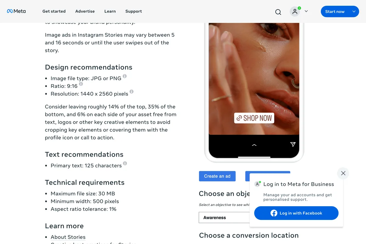
We pulled 639 live Instagram ads from Meta's Ad Library, found that over half showed no 9:16 version, and checked 16 real 9:16 Stories ads against Meta's own safe zone. Six keep everything clear, four sit on the edge, and six put copy where the interface sits, including the three smallest advertisers.
Most lists of Instagram Stories ad examples are a gallery of famous campaigns with a sentence under each. That is pleasant to scroll and hard to learn from, because you cannot tell which choices made the ad work and which were the brand's budget. So we did something narrower. We pulled live ads from Meta's own Ad Library, kept the ones actually made for the Stories screen, and checked each against the one layout rule Meta publishes. The result is sixteen real ads, what each gets right, and the mistake that six of them share.
Our articles are still written by humans!
Get human written articles in your Google feed.
What do Instagram Stories ads look like right now?
Less vertical than you would think. On 3 November 2026 we searched the Ad Library for active US Instagram ads under five small business keywords and recorded the shape of all 639 that loaded:
| Format in the Ad Library | Ads | Share |
|---|---|---|
| Video, 9:16 | 253 | 40% |
| Image, 9:16 | 51 | 8% |
| Image, square | 122 | 19% |
| Image, 4:5 | 67 | 10% |
| Image, 2:3 or 3:4 | 35 | 5% |
| Image, wider than square | 40 | 6% |
| Video, 4:5, square or wide | 71 | 11% |
| Total | 639 | 100% |
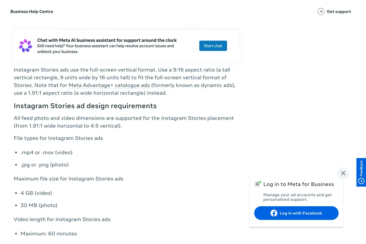
Only 304 of 639, under half, showed a 9:16 file. Video advertisers mostly make one: 253 of 324 videos were 9:16. Image advertisers mostly do not: 51 of 315. Meta allows feed shapes from 1.91:1 to 4:5 in the Stories placement, so many of the rest could run there without filling the screen. Its help page says so in one line:
All feed photo and video dimensions are supported for the Instagram Stories placement (from 1.91:1 wide horizontal to 4:5 vertical).
A square image in a 9:16 slot uses a little over half the screen. If you are paying for the whole screen, design for it. The sixteen examples below are all ads whose advertiser did.
How we checked each ad
Meta publishes one layout rule for Stories and Reels ads, in its Ads Guide: keep roughly 14% of the top, 35% of the bottom and 6% of each side free of text, logos and other key elements, so the profile icon and the call to action button do not cover them. We drew those bands in red over each ad. White dashes mark the safe box in the middle. At 1080 x 1920 the box starts 269 pixels down and ends 672 pixels from the bottom.
Here is all sixteen at once, with our verdict under each. Green kept everything that has to be read inside the box. Amber put a logo, a headline line or the offer partly in a band. Red put copy, a button or contact details in a band.
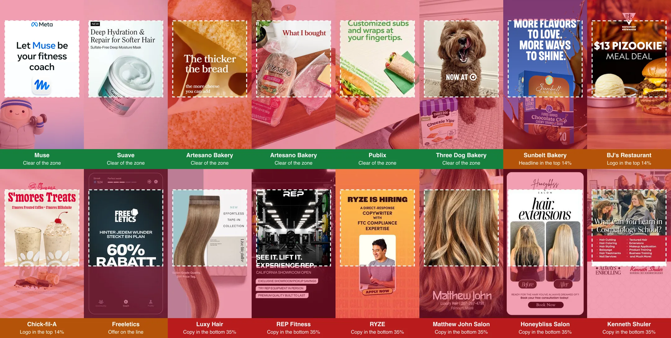
Six Stories ads that keep everything clear
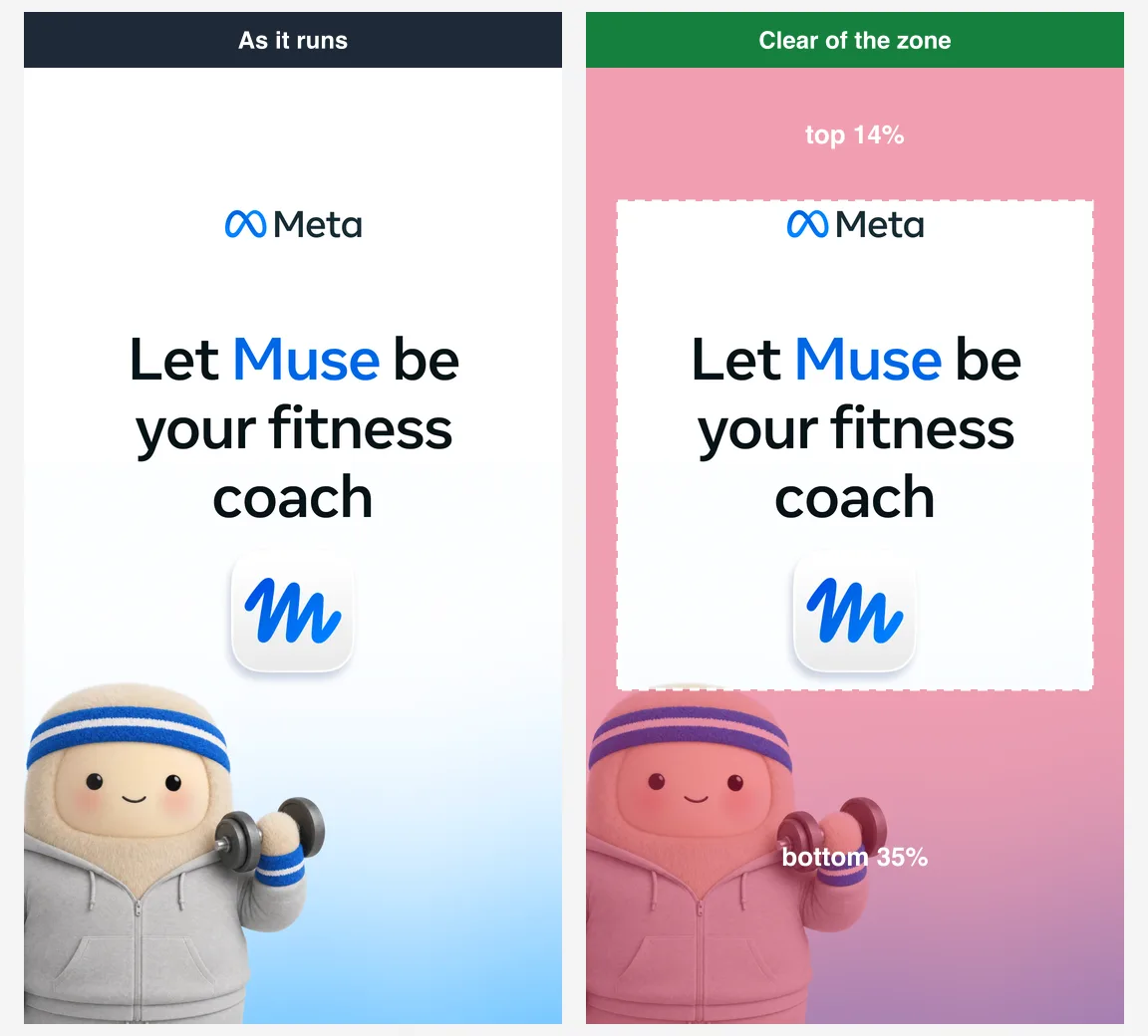
1. Muse: one line, one icon, nothing else
An app ad that is almost all white space: the Meta logo near the top, a single line of copy, the app icon, and a mascot standing in the bottom band where nothing needs to be read. The bottom 35% is the picture, not the pitch. Started 26 October 2026, Library ID 1590611829468461.
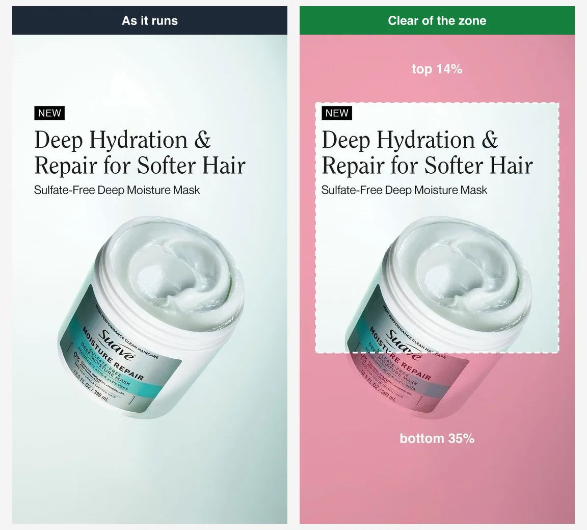
2. Suave: a product shot that stops above the button
Headline and product line at the top of the safe box, the jar of hair mask below them, and the bottom of the frame left to a soft gradient. Even the small NEW label sits just inside the top line. Started 18 September 2026, Library ID 2646821992427847.
3. Artesano Bakery: one sentence across the middle
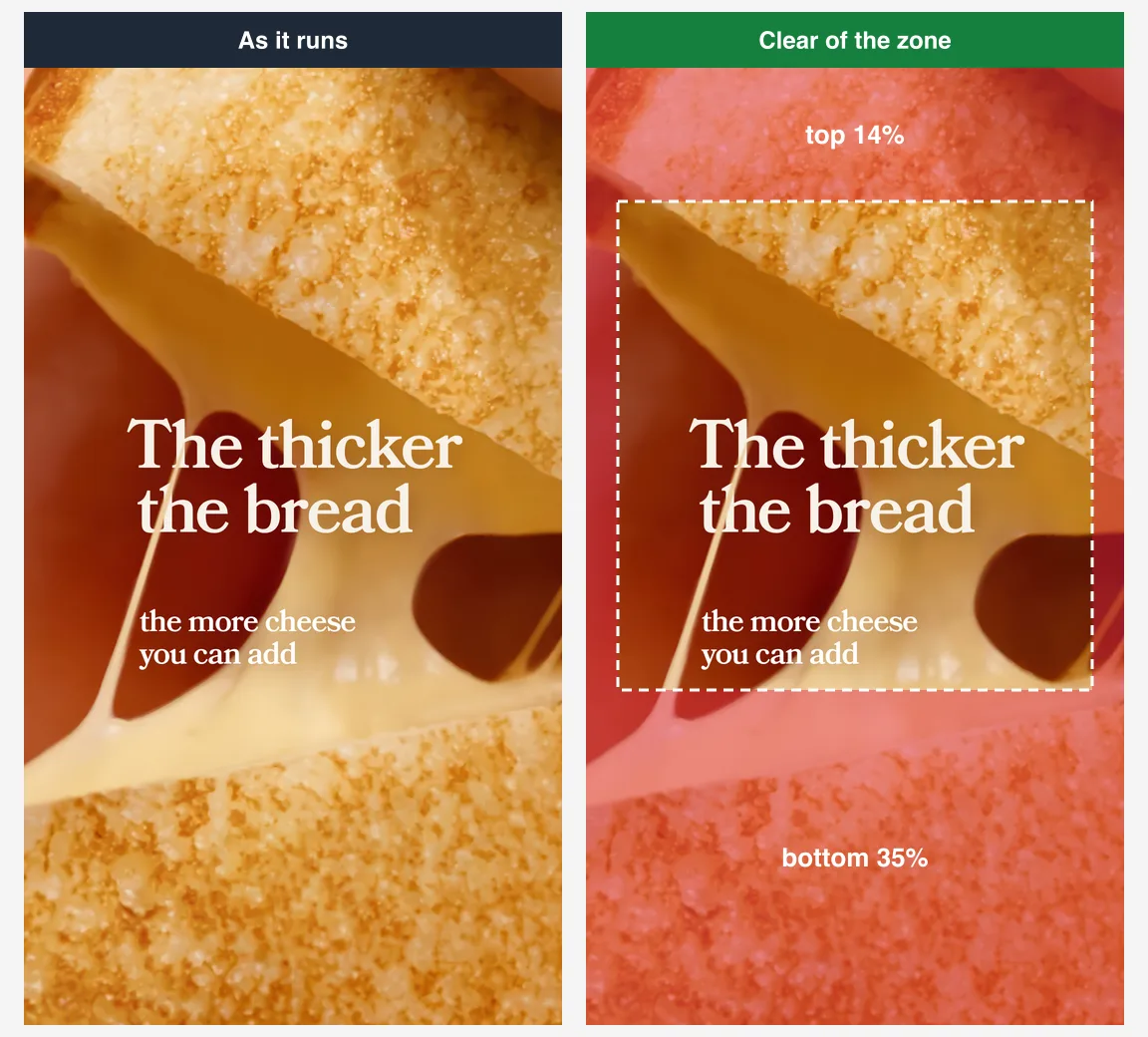
A close-up of melted cheese with a two-part line set in the middle of the frame: The thicker the bread, the more cheese you can add. The whole message is inside the box and the texture does the rest. Started 11 August 2026, Library ID 1982457409081305.
4. Artesano Bakery: the haul shot
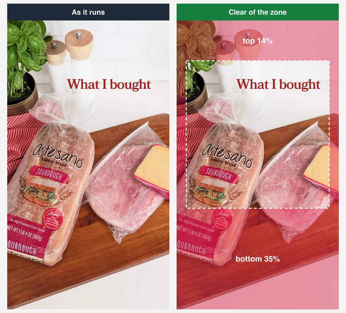
The same advertiser, a different idea a day later: a shopping haul on a chopping board under the words What I bought, in the style of a creator's own story. It reads as a post rather than an ad, and the one line of text is high in the safe box. Started 12 August 2026, Library ID 2247616365985274.
5. Publix: the headline right on the top line
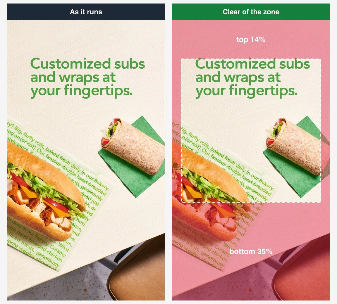
A sub and a wrap on a counter, with Customized subs and wraps at your fingertips set right on the 14% line. It is a pass, just. Nothing else is written on it, which is why it works. Library ID 1960357938014694.
6. Three Dog Bakery: the retailer in the middle
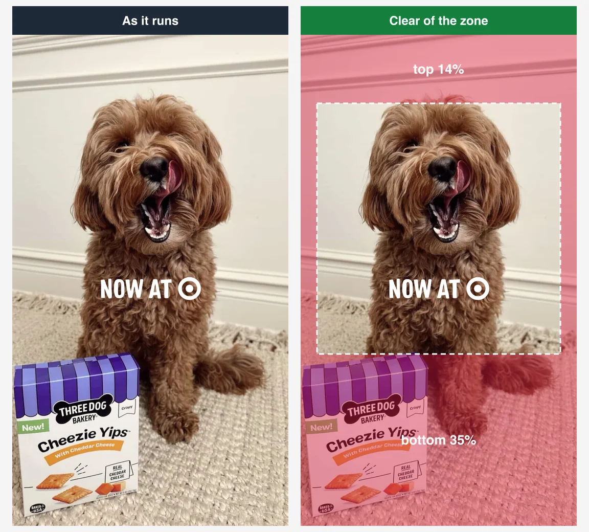
A dog licking its nose, a box of cheese treats in the corner, and two words that carry the whole ad: Now at, followed by the Target logo. The words sit dead centre. The box is in the bottom band, which costs nothing because the box is decoration. Started 21 March 2026, Library ID 1556575928776458.
Four that put a logo, a headline or the offer on the edge
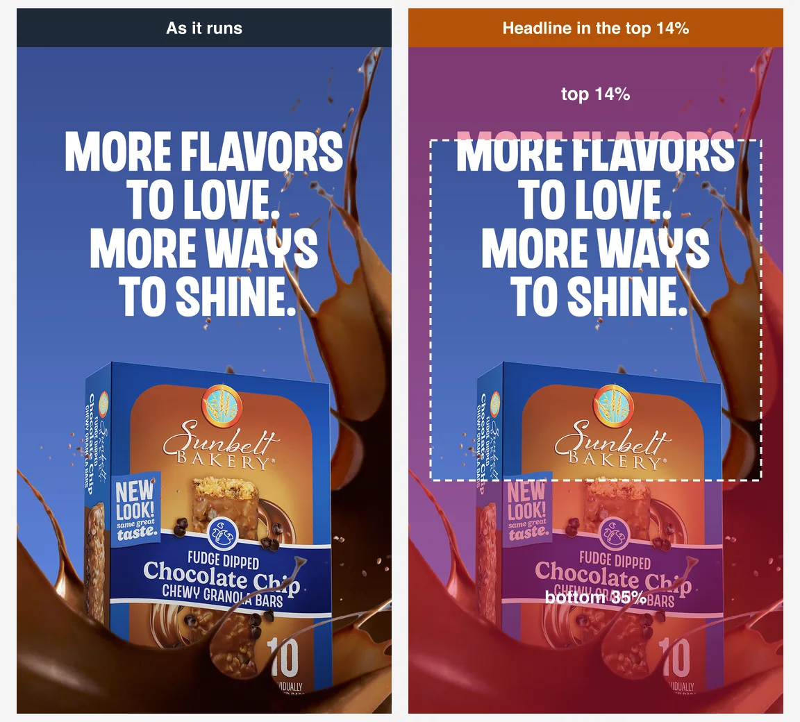
7. Sunbelt Bakery: the top line of the headline in the top band
A four-line headline above a granola bar box splashing through chocolate. Three lines of the headline are in the safe box, but the first, More flavors, sits about half inside the top band, where the account name and progress bar go. The Sunbelt logo on the pack is in the box; Chocolate Chip and the New look flash on the lower half of the pack fall in the bottom band. Started 30 September 2026, Library ID 1768042541201908.
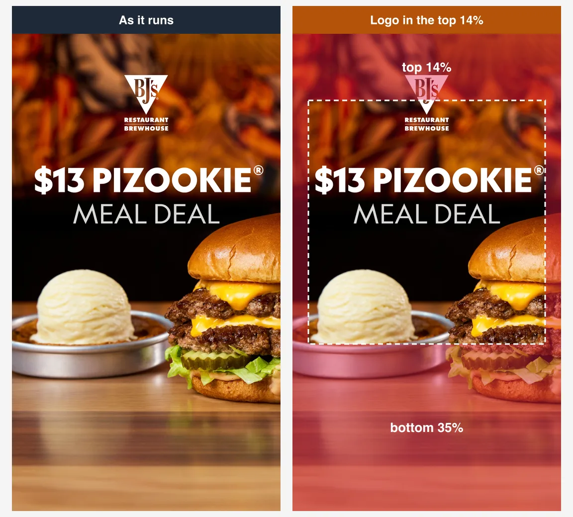
8. BJ's Restaurant: the logo above the line
A burger and a cookie skillet under a big $13 Pizookie meal deal: price, product and offer all in the safe box. The restaurant's logo, though, sits mostly in the top 14%, where Instagram shows the advertiser's name and profile picture. On a phone, the logo would likely sit under the account name. Started 12 October 2026, Library ID 1078536981679118.
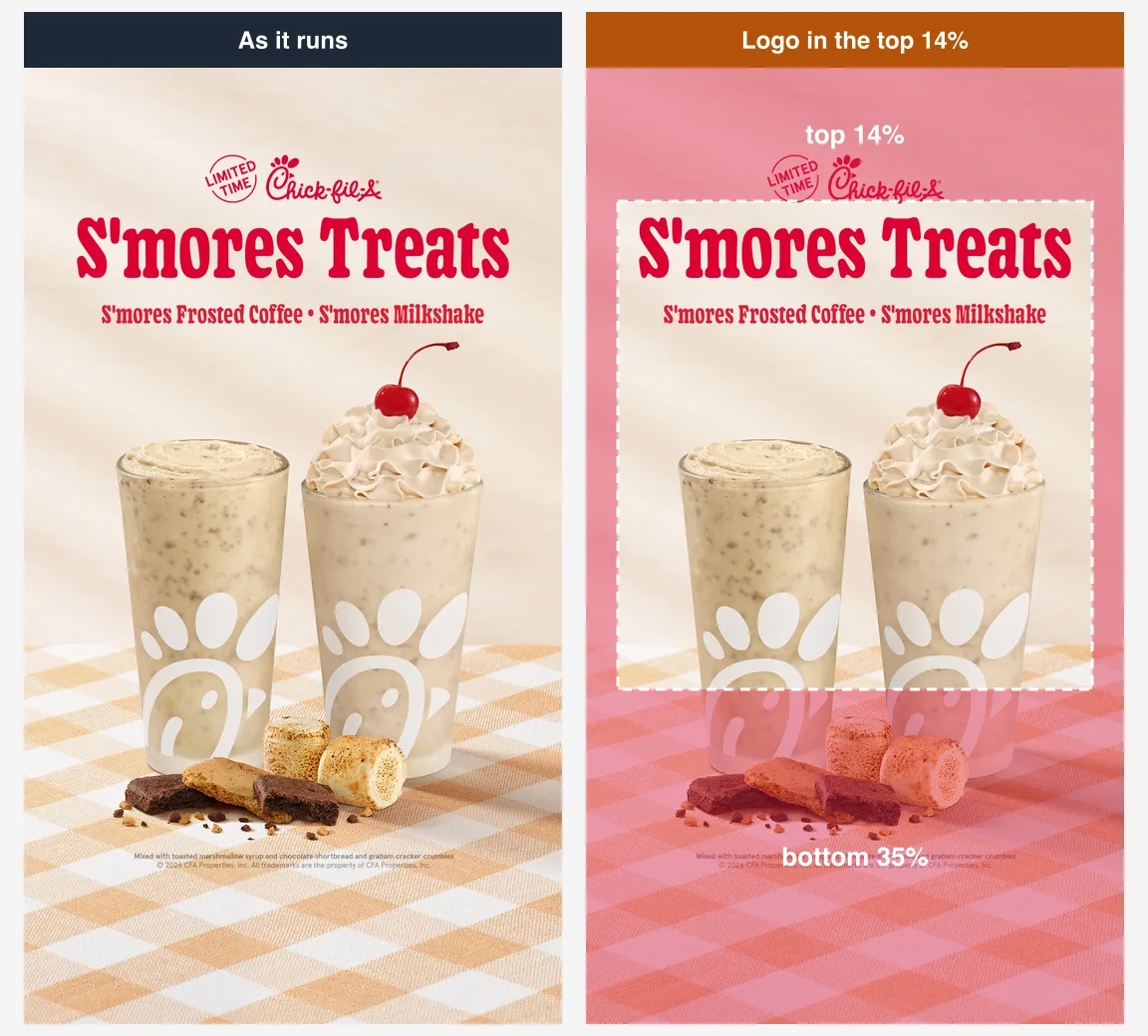
9. Chick-fil-A: same logo, same place
A frosted coffee and a milkshake, S'mores treats in red, and the Chick-fil-A logo with a Limited time badge above it, inside the top band. The legal small print at the foot is in the bottom band too, which is normal and does not count. Started 28 August 2026, Library ID 1035689506136196.
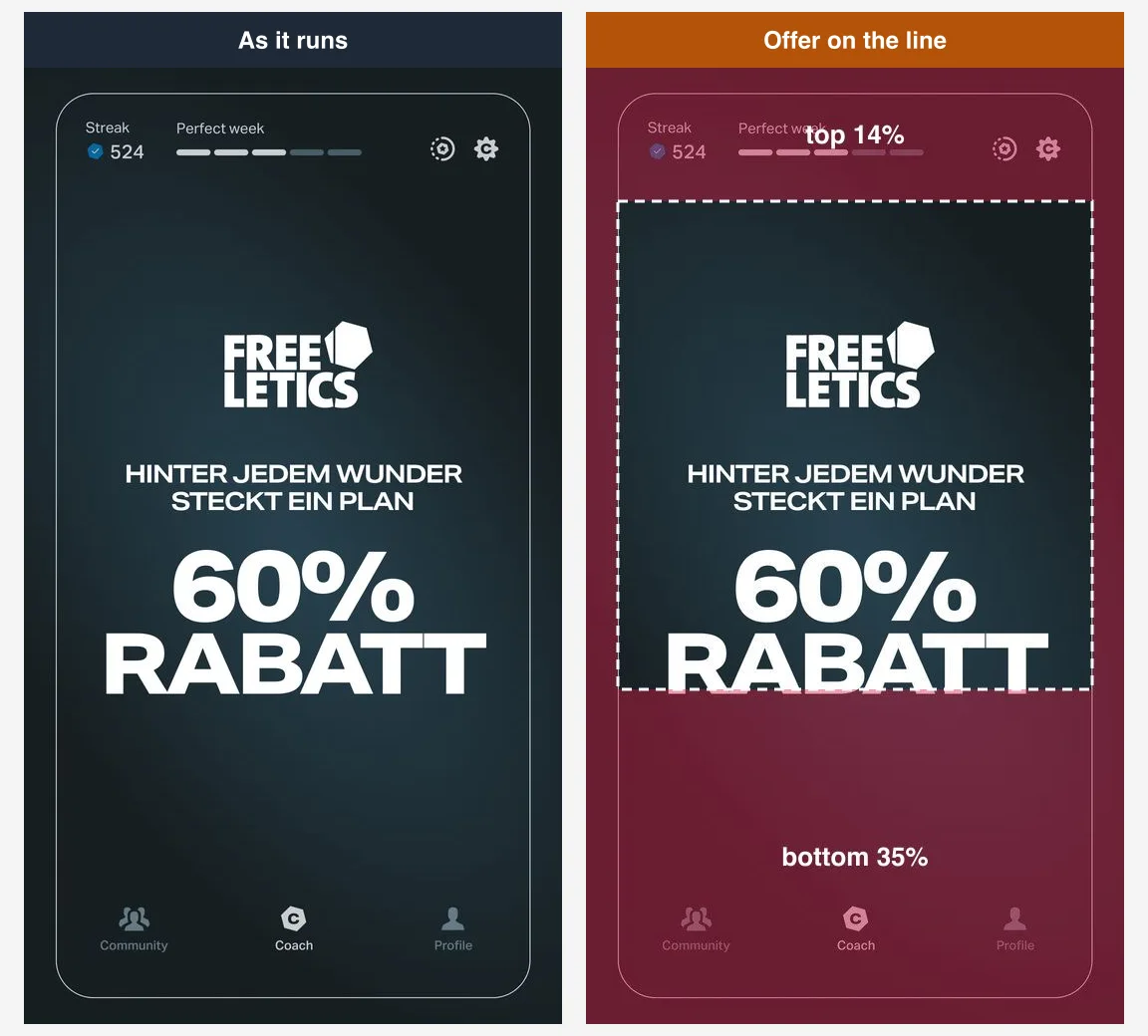
10. Freeletics: the offer sits on the line
A German-language ad built to look like the app itself, with 60% Rabatt (60% off) as the headline. The second line of that headline sits right on the 65% line, half in and half out of the bottom band. The app's own tab bar is drawn in the band below, which is clever: it is decoration that looks like interface, so nothing real is lost under the real interface. Started 20 January 2026, Library ID 1429113835589185.
Six that put copy where the interface sits
11. Luxy Hair: the selling line in the bottom band
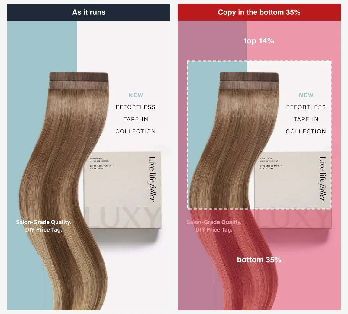
A long tape-in hair extension down the length of the frame, a small product card, and the line Salon-grade quality, DIY price tag, which is the actual argument of the ad, set in the bottom band. That is where Instagram puts the Shop now button. Started 3 August 2026, Library ID 1051502170767632.
12. REP Fitness: three offers under the button
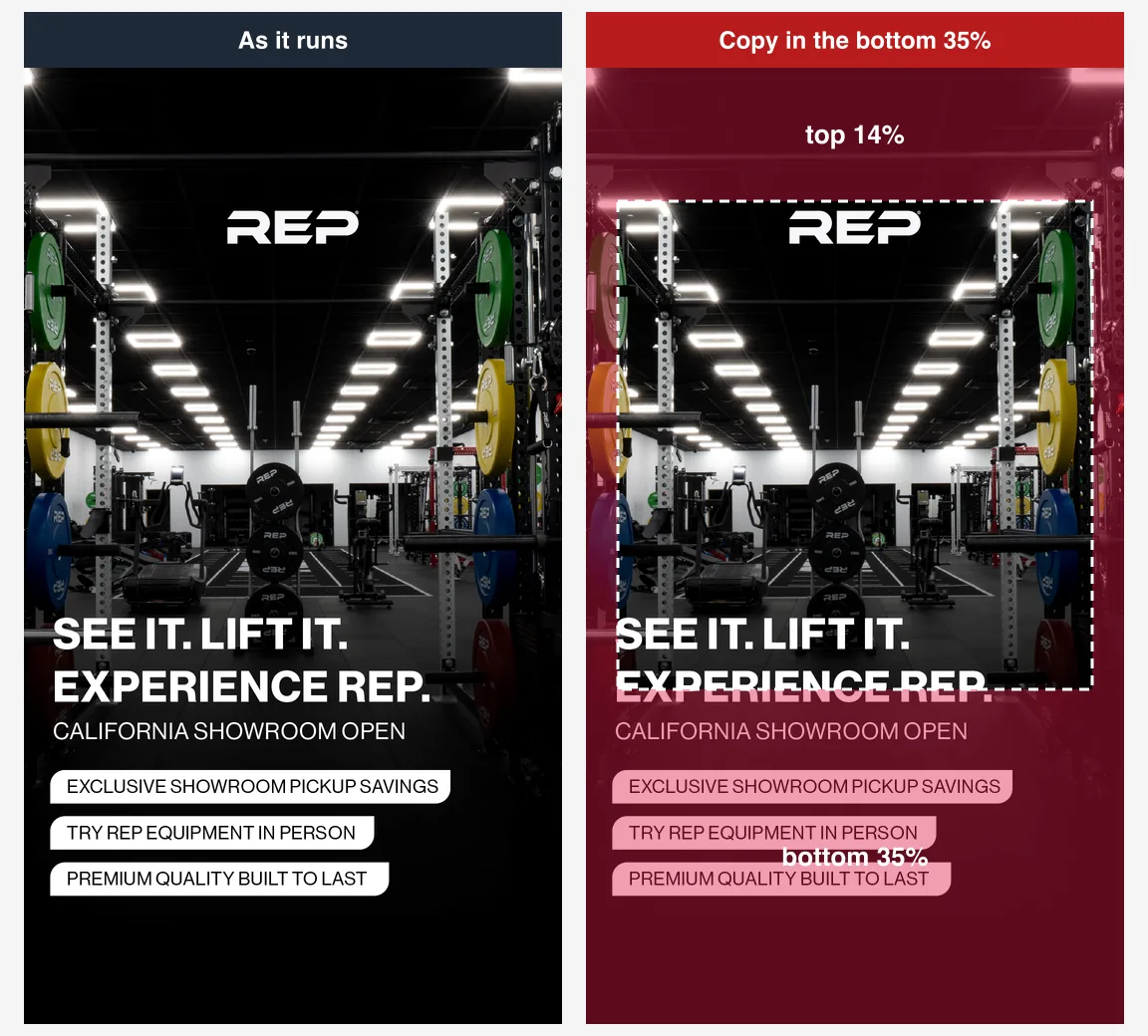
A gym showroom photo, a headline that starts in the box and ends below the line, and then three pill-shaped offers (showroom pickup savings, try equipment in person, built to last) stacked entirely in the bottom band. Three reasons to visit, and the interface sits on all three. Started 18 May 2026, Library ID 1997656561112904.
13. RYZE: an Apply now button under the real one
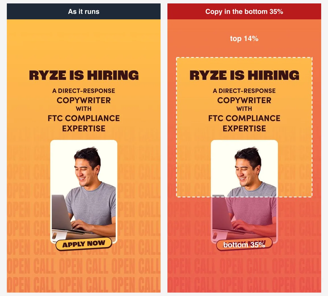
A recruitment ad for a copywriter, with a large headline, a photo of a smiling man at a laptop, and a drawn Apply now button near the foot of the frame. Instagram puts its own call to action in the same place, so the ad ends up with two buttons, one of which does nothing. Started 28 October 2026, Library ID 4617519425134541.
14. Matthew John Salon: the name and phone number at the foot
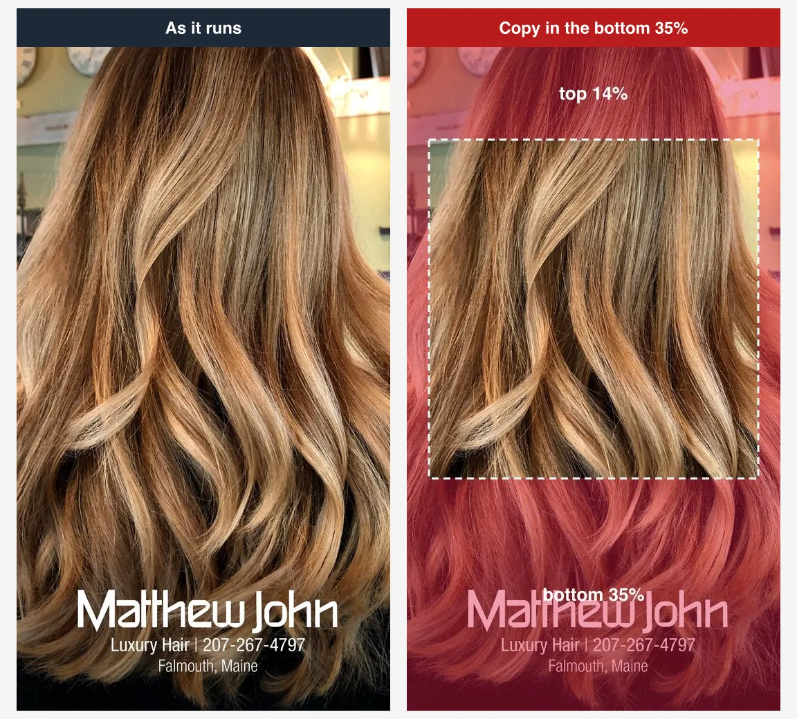
A beautiful photo of long, toned blonde hair, and then the salon's name, the words luxury hair, a phone number and the town, all in the bottom 35%. It is how you would lay out a print ad. In a story, the one piece of text that tells you who and where is the piece the Book now button sits on. Started 24 February 2025, Library ID 2020255515121267.
15. Honeybliss Salon: both bands at once
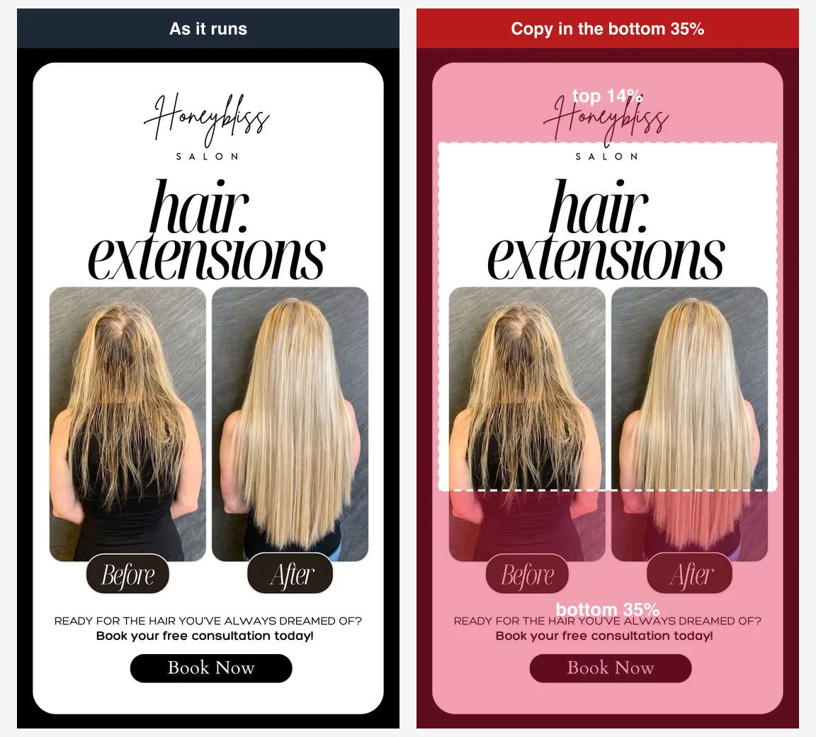
A before and after of hair extensions, which is exactly the right idea for a salon. The logo sits in the top band, the before and after labels and the closing line (ready for the hair you've always dreamed of, book your free consultation today) sit in the bottom one, and a drawn Book now button sits under Instagram's real Book now button. The middle of the ad is excellent. The edges are where it loses its words. Started 29 September 2025, Library ID 757822953739284.
16. Kenneth Shuler School of Cosmetology: the brand below the line
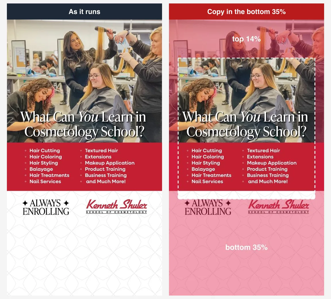
A busy salon classroom, a headline asking what you can learn in cosmetology school, a red panel listing what it teaches, all in the box. Then, below the line, Always enrolling and the school's logo. Of everything on the ad, the name of the school is the one thing a viewer is most likely to miss. Started 4 June 2026, Library ID 984063284377934.
Why did the smallest advertisers get it wrong?
Three of the sixteen advertisers are small: two single salons and a regional cosmetology school. All three failed, and they failed the same way. Each put what a nearby customer needs, the name, the number, the place or the booking line, at the bottom of the frame. The national brands mostly did not. Chick-fil-A, Publix, Suave and BJ's, whatever else they did, kept their selling words in the middle.
Sixteen ads cannot prove a pattern, and we would not claim one. But the reason is easy to guess. The bottom of a flyer, a print ad or a feed post is where contact details belong, and a small business that adapts its feed post for Stories keeps that layout. In Stories, the bottom is where Instagram puts the advertiser's call to action. Your phone number does not need to be there; your Book now or Call now button already is.
- Move contact details up or out. The call to action button does the job a phone number used to do. If the number matters, put it in the middle.
- Delete drawn buttons. Meta adds a real one in the bottom band.
- Move the logo down. The account name and picture already sit at the top.
- Let the picture fill the bands. A product, a texture, a mascot. Nothing in a band should need reading.
Our own templates fail it too
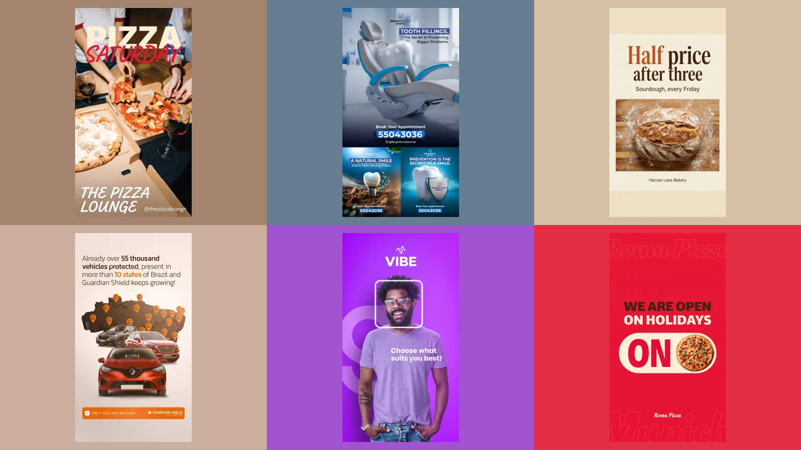
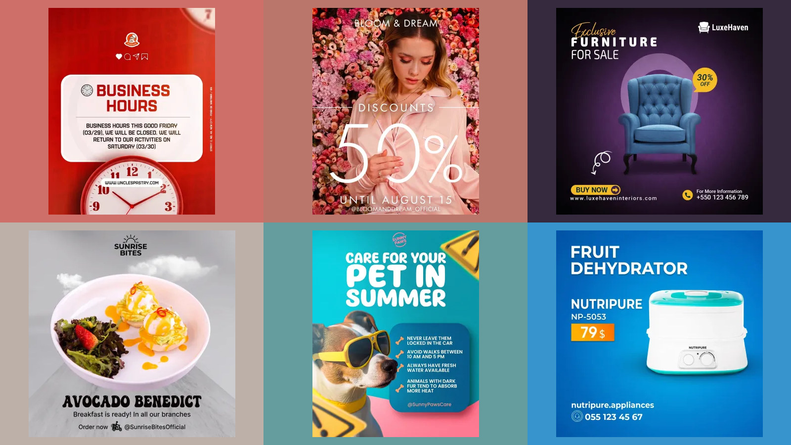
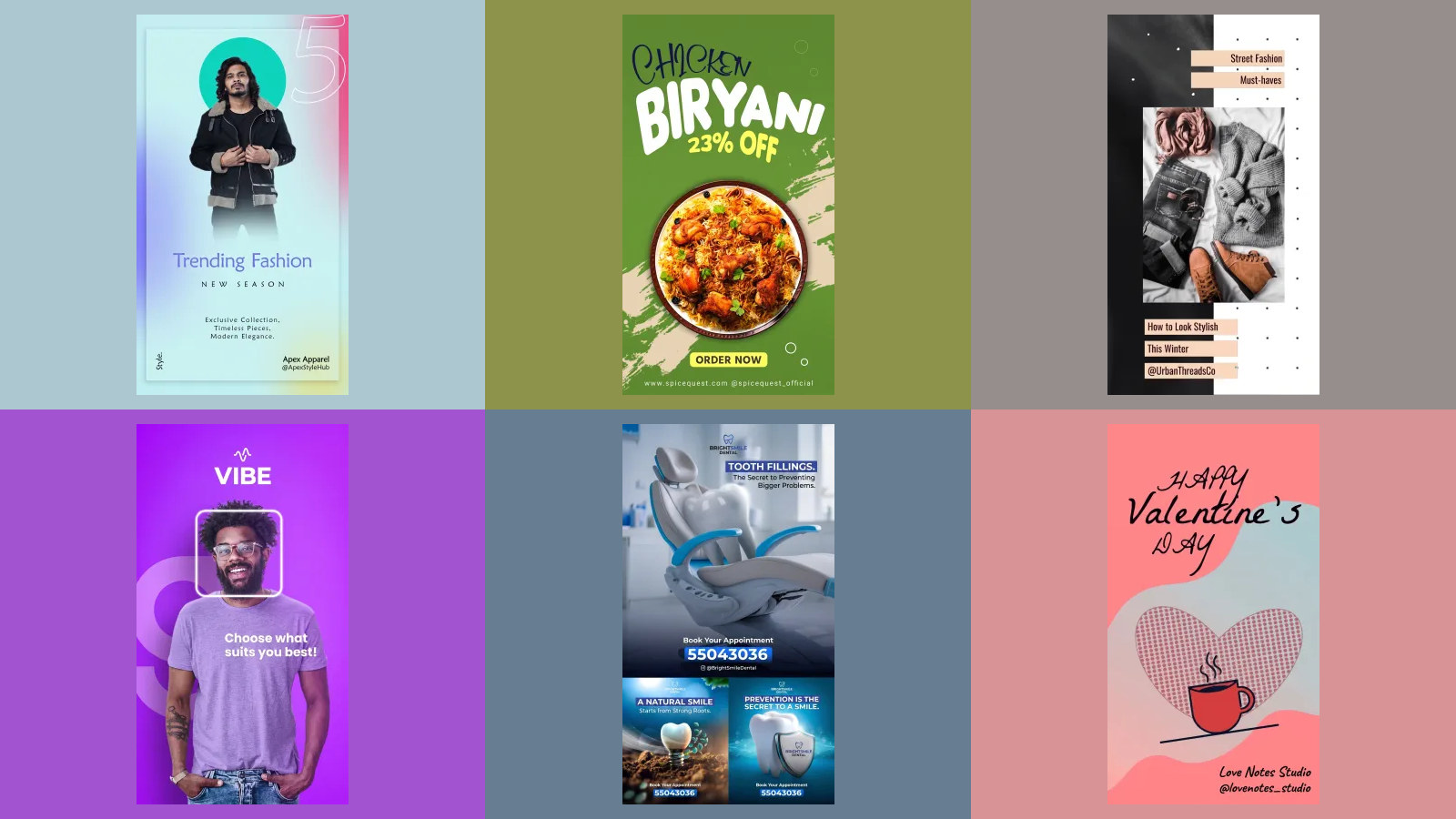
Before you think this is easy: here are four 9:16 posts from our own gallery under the same overlay. They are Behance designs redrawn by our image model, and every one puts something in the bottom band, a handle, an Order now button, a workout line, an appointment strip. Not one would pass the check we just ran on sixteen advertisers.
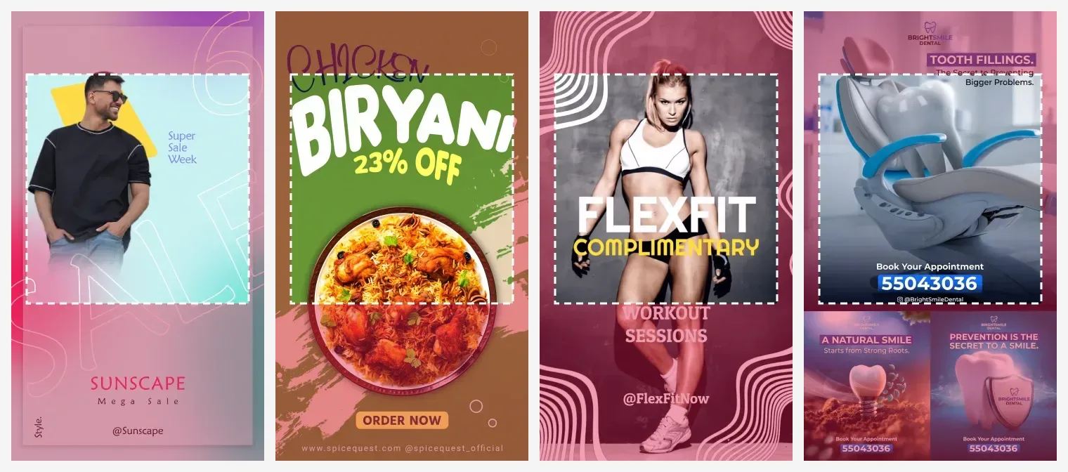
That is the honest reason this mistake is so common: almost every vertical template on Behance, Canva or anywhere else is drawn as if the screen were empty. If you start from one, move its footer into the middle before you run it as an ad. The pixel numbers and free overlay files to check your own are in our Instagram safe zone guide.
What are the specs for an Instagram Stories ad?
| Spec | Instagram Stories ad | Where it comes from |
|---|---|---|
| Shape | 9:16 recommended; feed shapes from 1.91:1 to 4:5 also accepted | Meta help, design requirements |
| Size | 1080 x 1920 recommended; Ads Guide lists 1440 x 2560 for video | Meta help and Ads Guide |
| Safe zone | 14% top, 35% bottom, 6% each side | Ads Guide |
| Video length | 1 second to 60 minutes | Ads Guide |
| Long videos | 16 seconds or longer may be split into up to three cards | Ads Guide |
| File size | 4 GB for video | Ads Guide |
| Primary text | 125 characters | Ads Guide |
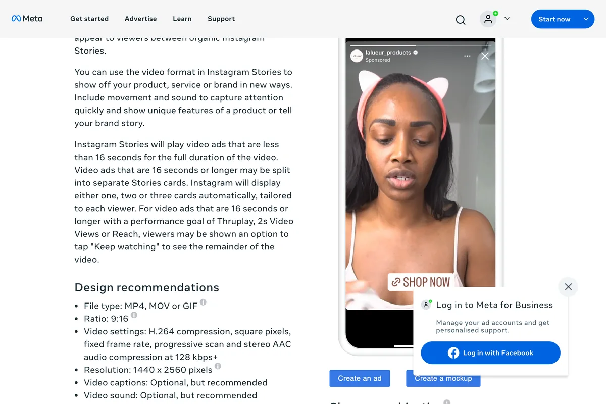
One line on Meta's own pages contradicts the rest, and it is worth knowing about before somebody quotes it at you. Meta's help page on aspect ratios marks 9:16 as recommended for Instagram Stories in its table, and then says this underneath:
Instagram Stories and Facebook Stories support 1.91:1, 16:9, 1:1, 4:5 and 2:3, with 2:3 recommended.
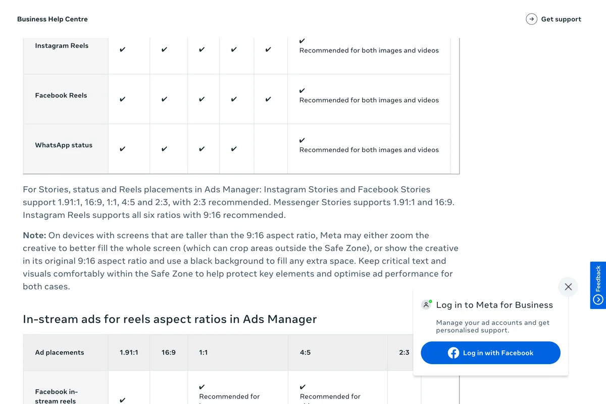
Go with 9:16, which is what the table, the Ads Guide and the design requirements page all say. The same help page adds that on phones taller than 9:16, Meta may zoom the ad to fill the screen, which can crop what sits outside the safe zone. One more reason the middle is where the words go.
How to find Stories ad examples for your own industry
Every ad above is public, and so is every ad your competitors are running. Meta's Ad Library is free to search:
- Open facebook.com/ads/library, choose your country and All ads, and search for your trade or a competitor's name.
- Under Filters, set Platform to Instagram and Active status to Active ads.
- Scroll for tall previews. The Library has no placement filter, so a tall 9:16 preview is the best sign an ad was made for Stories and Reels.
- Open See ad details for the start date. An ad that has been running for months is one its advertiser has chosen to keep paying for, which is the closest thing to a performance signal the Library gives you.
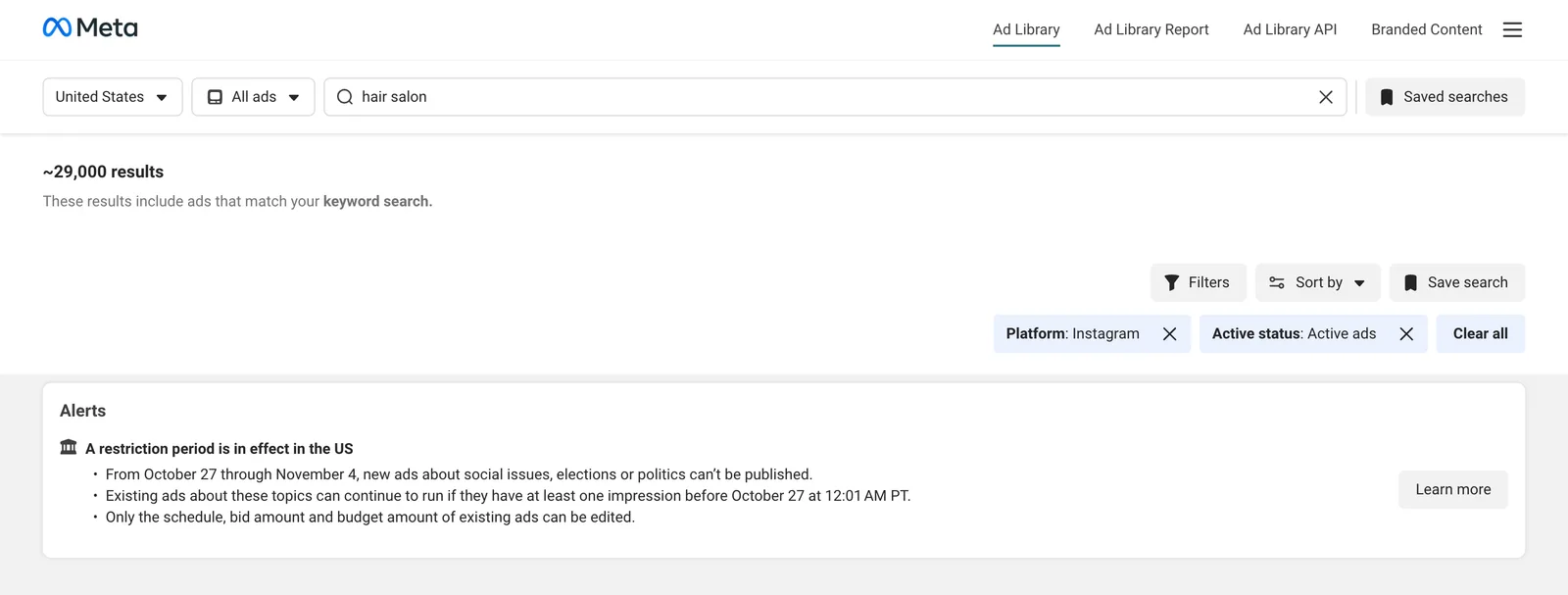
When you find one you like, hold it up to the safe zone before you copy it. Ten of the sixteen ads in this article would have taught you at least one wrong habit. For what to put in an ordinary, unpaid story, see our Instagram story ideas for business; for the dimensions, Instagram story size and Instagram reel size.
Frequently asked questions
What makes a good Instagram Stories ad?
One message, set in the middle of a 9:16 frame. In the sixteen live ads we checked, the cleanest layouts had a single line of copy inside Meta's safe zone and let the picture fill the top and bottom, where Instagram's own name, progress bar and call to action button sit.
What size should an Instagram Stories ad be?
9:16, at 1080 x 1920 pixels. Meta's Ads Guide also lists 1440 x 2560 for video, which is the same shape at a higher resolution. Feed shapes from 1.91:1 to 4:5 are accepted, but they do not fill the screen.
What is the safe zone for Instagram Stories ads?
Meta's Ads Guide says to keep roughly 14% of the top, 35% of the bottom and 6% of each side free of text and logos. At 1080 x 1920 that is the top 269 pixels, the bottom 672 and 65 on each side.
Where can I see examples of Instagram Stories ads?
In Meta's Ad Library, which is free to search. Search for a trade or a brand, filter to Instagram and active ads, and look for tall 9:16 previews. The Library has no placement filter, so the shape is the best clue that an ad was built for Stories.
Can I use a square image for an Instagram Stories ad?
Yes, Meta accepts feed shapes from 1.91:1 to 4:5 in the Stories placement, and about half the live Instagram ads we checked had no 9:16 version. But a square image uses only a little over half of a 9:16 screen. If you are paying for the screen, make a 9:16 version.
How long can an Instagram Stories video ad be?
From 1 second to 60 minutes, according to Meta's Ads Guide. Videos under 16 seconds play in full; longer ones may be split into up to three Stories cards, and for some campaign goals viewers may see a Keep watching option for the rest.
How we researched this
- The 639 ads come from Meta's Ad Library, searched on 3 November 2026 with country set to the United States, platform to Instagram and status to active, for five keywords a small business might use: coffee, bakery, hair salon, fitness and restaurant. We kept every ad the first page of results loaded after scrolling, in the Library's default order, and recorded whether its preview was a video or an image and its shape. The Library shows one version of each ad, so an ad listed as having multiple versions may also carry a 9:16 version we did not see; the format counts describe what the Library shows, not every file in every campaign.
- The Library does not let you filter by placement, so an Instagram ad in it may run in the feed, Stories, Reels or all three. We took the 9:16 image ads from those results, which are the ones built for Stories and Reels, downloaded each at its original size (1080 x 1920 for most, 1152 x 2048 for two) and drew Meta's safe zone over it: 14% of the top, 35% of the bottom and 6% of each side, from the Meta Ads Guide. Sixteen are on this page. We picked them to cover the five searches and a range of advertisers, from national brands to single salons, not as a random sample, so the pass and fail counts describe these sixteen and nothing wider.
- The verdicts are ours, read by eye against the overlay at 540 x 960 with the 14% and 65% lines drawn on, in three tiers. Red: body copy, a button, a price, contact details or the brand name sits inside a band. Amber: a logo, one line of a headline or the main offer sits partly in a band while the rest of the copy is clear. Green: nothing that has to be read is in a band; a product photo, a background pattern or legal small print there does not count. Every overlay is shown so you can disagree with us.
- We saw only the creative files. We have no idea how any of these ads performed, and nothing here says that an ad which breaks the safe zone does worse. Each ad is credited to its advertiser and linked to its Library entry; we show them to comment on their layout.
Sources
- 1Active Instagram ads in the United States, searched for coffee, bakery, hair salon, fitness and restaurant
- 2Image ad specs on Instagram Stories
- 3Video ad specs on Instagram Stories
- 4Design requirements for Instagram Stories ads
- 5Aspect ratios supported by placements in Meta Ads Manager
- 6About text overlays and the safe zone for ads on Facebook and Instagram