9 Gemini prompts for poster design, and 3 that went wrong
We ran twelve poster prompts through Gemini on 20 September 2026 and printed every result, including the bakery poster that came back with an invented address and the loaf of bread titled Avocado.
Most pages of Gemini poster prompts show you the prompt and a picture that may or may not have come from it. This one was built the other way round. We wrote twelve prompts for the posters a small business actually needs, ran each one once through Google's image model on 20 September 2026, and printed whatever came back. Nine are worth copying. Three went wrong in ways that are more useful than the nine.
Our articles are still written by humans!
Get human written articles in your Google feed.
The short version is that Gemini can now set type. Six rows of prices came back with every digit right. What it cannot do is know anything about your business, and when you leave a gap it fills the gap with something plausible. On a poster, plausible means an address you do not have and an offer you are not running.
What happens when you just ask for a poster
This is the prompt most people type first, and it is worth seeing what it costs before anything else.
The prompt that went wrong: five words and no facts
Make a poster for a bakery sale.
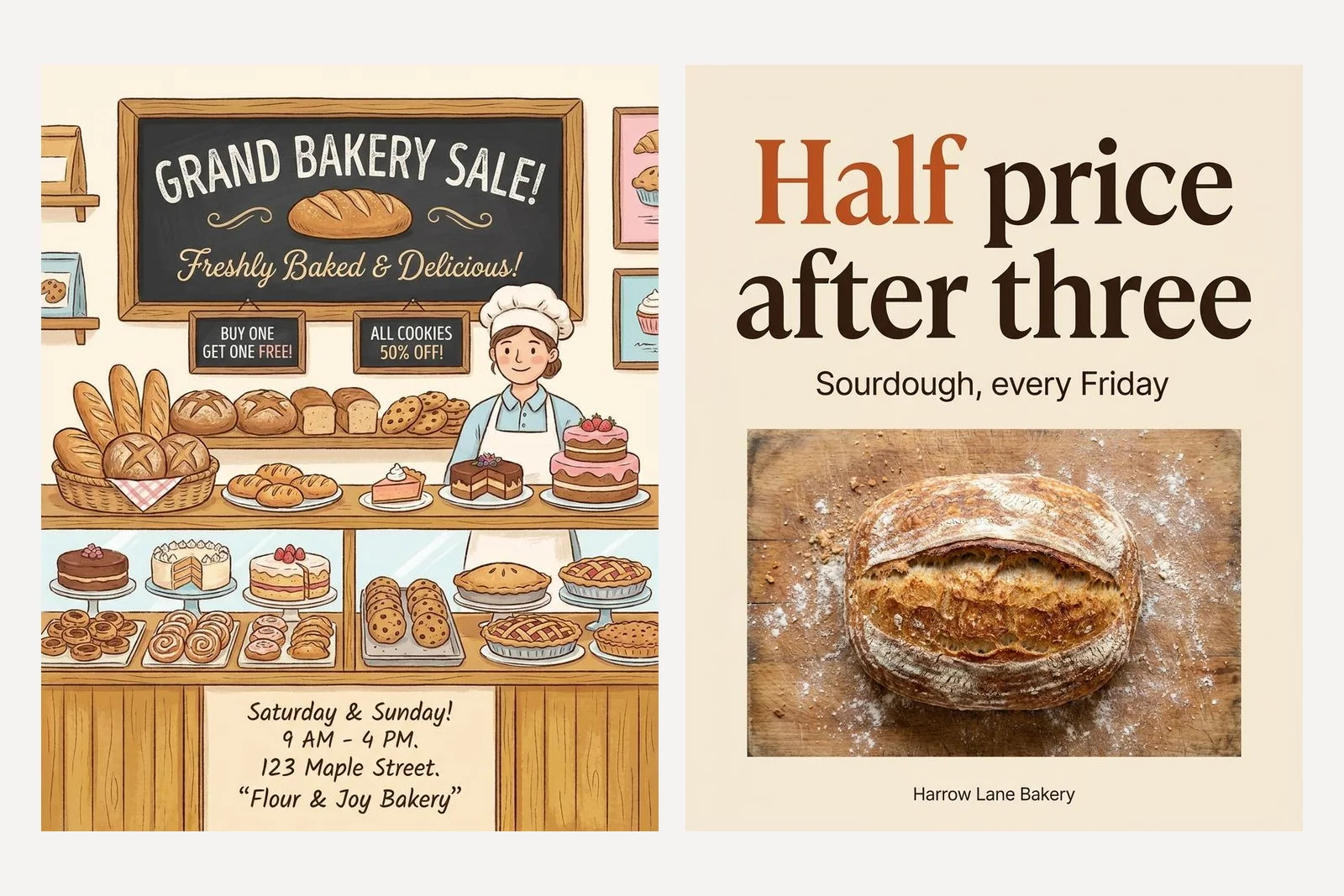
Look at what the left hand poster says. The bakery is called Flour and Joy. It is at 123 Maple Street. The sale runs Saturday and Sunday, 9 till 4. It is buy one get one free, and all cookies are half off. None of that was in the prompt, because nothing was in the prompt. The model was asked for a poster, a poster has details on it, so it supplied some.
That is not a drawing problem. The picture is charming. It is a facts problem, and it is the same one we describe in why AI posts sound like AI: the model completes the shape of the thing you asked for. A caption with an invented claim in it is embarrassing. A poster with an invented offer on it is a promise to a customer.
The brief that works, part by part
Google's own documentation makes the same point in its own words: be hyper-specific, because the more detail you provide, the more control you have. For a poster, detail means six things, and every working prompt on this page has all six.
| Part | What to write | What happens if you leave it out |
|---|---|---|
| Format | 4:5 Instagram post, 1:1, or 9:16 Story | You get a shape you then have to crop, and the crop takes the headline |
| Subject | One sentence saying what this poster is about | It draws the business in general, which is the same poster every time |
| The words | Every string in quotation marks, exactly as it should appear | It writes its own, and its own includes prices and dates |
| Layout | Where the headline sits, what the picture is, how much space is empty | A busy scene with the text wherever it fits |
| Colour by role | Background, headline and accent, each with a hex code and a job | The codes get used, but on the wrong things |
| Type and logo | A type style described in words, and an explicit line about the logo | An invented emblem appears where a logo would go |
1. The offer poster
Design a 4:5 Instagram post for a neighbourhood bakery called Harrow Lane Bakery. Subject: sourdough loaves are half price every Friday after 3pm. Headline, set large: "Half price after three". Smaller line under it: "Sourdough, every Friday". Layout: one confident headline in the upper half, a single loaf photographed from above on a floured board in the lower half, generous empty space. Colours by role: background warm cream #F4EBDD, headline deep brown #3A2618, accent burnt orange #C4572F used only on the word "Half". Type: a high contrast serif for the headline, a plain sans for the small line. No logo, no emblem, no icons; set the bakery name as small plain type at the bottom.
That is the right hand poster in the figure above. Every instruction survived: the two strings are exact, the orange is on one word, the name is small plain type at the foot, and there is no emblem. It took 34 seconds. The thing to notice is how little of the prompt is about style. Almost all of it is facts and positions.
Prompts where the numbers have to be right
This is the category that was not possible a model or two ago, and the one a small business needs most. Google now says plainly that Gemini excels at rendering text, and asks you to be clear about the text, the font style and the overall design. We tested that claim with rows of prices and rows of dates, because those are the posters where one wrong digit matters.
2. A price list
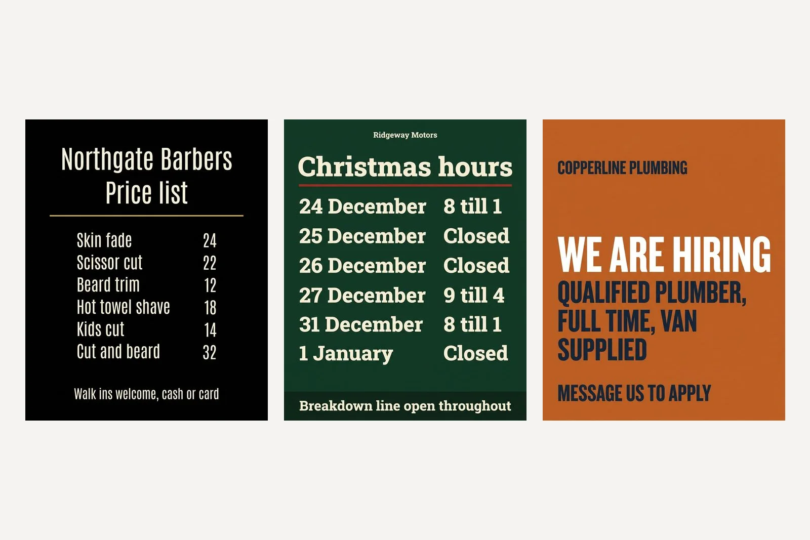
Design a 4:5 Instagram post that is a price list for a barber shop called Northgate Barbers. Title: "Price list". Rows, exactly these, left aligned name and right aligned price: "Skin fade 24", "Scissor cut 22", "Beard trim 12", "Hot towel shave 18", "Kids cut 14", "Cut and beard 32". Footer line: "Walk ins welcome, cash or card". Black background, off white type, one thin gold rule under the title. One typeface throughout, a condensed sans. No illustration, no logo, no icons.
3. Holiday opening hours
Design a 4:5 Instagram post that is a notice of holiday opening hours for a garage called Ridgeway Motors. Title: "Christmas hours". Rows, exactly these, day on the left and hours on the right: "24 December 8 till 1", "25 December Closed", "26 December Closed", "27 December 9 till 4", "31 December 8 till 1", "1 January Closed". Footer: "Breakdown line open throughout". Dark green background #173B2C, cream type #F3EBDD, one thin red rule #B8342C under the title. One typeface, a sturdy slab serif. No illustration, no holly, no snow, no logo; business name as small type at the top.
4. We are hiring
Design a 4:5 Instagram post for a plumbing company called Copperline Plumbing that is hiring. Headline: "We are hiring". Under it: "Qualified plumber, full time, van supplied". Call to action at the bottom: "Message us to apply". Bold flat layout: solid copper orange background #B8622E, white headline filling the width, navy #16263A for the smaller lines. Heavy grotesque sans. No illustration, no logo, no icons; company name as plain type top left.
Two honest notes on those three. The price list put the business name into the title, above the words Price list, which we did not ask for and did not mind. The hiring poster set everything in capitals, which we also did not ask for, and made the second line nearly as large as the first. If you care about case, say sentence case. The model treats silence as permission.
Correct in one run is not the same as correct every time. Read every digit before you post, every time, the way you would proofread a printed menu. We do that step by machine in our own product because no human does it reliably on the fortieth poster. What belongs on a poster like these in the first place is a separate question, and what a small business should post about is where we answered it.
Prompts where the mood matters more
5. An event, with an abstract picture
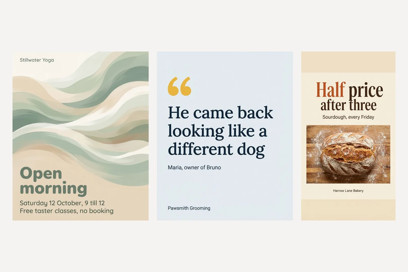
Design a 4:5 Instagram post announcing an event for a yoga studio called Stillwater Yoga. Headline: "Open morning". Details, smaller: "Saturday 12 October, 9 till 12" and "Free taster classes, no booking". Layout: headline bottom left, details directly under it, the top two thirds a calm abstract shape in soft sage and sand, no people. Type: a rounded sans, headline heavy, details regular. No logo; studio name as small type top left.
No people is doing real work in that prompt. A generated class full of generated students is a picture of a room that does not exist, shown to the people most likely to walk into the real one. The rule we set out in our Gemini prompts for the writing half applies here unchanged: generate the abstract thing, photograph the real thing.
6. A customer review
Design a 4:5 Instagram post that is a customer review for a dog groomer called Pawsmith Grooming. The quote, set large, exactly: "He came back looking like a different dog". Attribution under it, small: "Maria, owner of Bruno". Layout: the quote fills the middle of the frame, left aligned, with one oversized opening quotation mark in the accent colour top left. Colours by role: background soft blue grey #E6ECF0, quote dark navy #1B2A3A, accent warm yellow #E8B33A on the quotation mark only. Type: a friendly serif for the quote, plain sans for the attribution. No photo, no dog illustration, no stars, no logo; business name as small type bottom left.
Only do this with a review a real customer actually wrote, quoted exactly, with their permission. The model will happily set a testimonial you made up, and it will look identical. Whether it is honest is entirely on your side of the prompt.
7. A product post, and where it slipped
Design a 1:1 Instagram post for a candle brand called Fenwick and Moss. Subject: a new scent called Cedar Smoke. Headline: "Cedar Smoke". Line under it: "New this week, 38 hours of burn". Layout: the words on the left third on a dark green panel, the right two thirds a single amber glass candle on a dark stone surface with soft side light. Type: an elegant serif, headline large, line small caps. No logo or emblem; brand name as small type at the foot of the green panel.
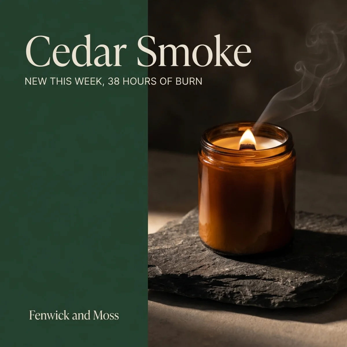
This is the good looking failure. The words are right and the light is lovely, but the headline was told to sit on the panel and it runs across the photograph instead. Fractions of the frame are held loosely. If the split matters, ask for less type or a shorter headline rather than a stricter fraction.
The larger problem is the candle. It is a beautiful candle and it is not the one Fenwick and Moss sell, because they do not exist and neither does it. For a real product, take the photograph yourself and attach it, then ask Gemini to build the layout around it. Google's documentation says the current models accept up to 14 reference images. A generated stand in for a thing you sell is a small lie to the person about to buy it. The sizes that photograph should be cut to are in our Instagram post size guide.
8. The same offer as an Instagram Story
Design a 9:16 Instagram Story for a neighbourhood bakery called Harrow Lane Bakery. Subject: sourdough loaves are half price every Friday after 3pm. Headline, set large: "Half price after three". Smaller line under it: "Sourdough, every Friday". Keep every word inside the middle 70 percent of the height, leaving the top 15 percent and the bottom 15 percent empty of text, because the app covers those areas. Background warm cream #F4EBDD, headline deep brown #3A2618, accent burnt orange #C4572F on the word "Half" only. A high contrast serif headline, plain sans small line. One loaf photographed from above on a floured board below the words. No logo; bakery name as small plain type under the loaf, still inside the middle 70 percent.
Explaining why is what made that one work. Told only to leave space, a model has no idea how much. Told that the app covers those areas, it left two clear bands and even tinted them slightly. The reasoning behind those margins, with the measurements, is in our Instagram Story size guide.
Using a reference image, and the loaf called Avocado
Attaching a poster you like and asking for one like it is the most natural thing to try. It is also how our own product works, so this is the failure we know best.
The prompt that went wrong: a reference and one line
Make a post like this one for a bakery called Harrow Lane Bakery.
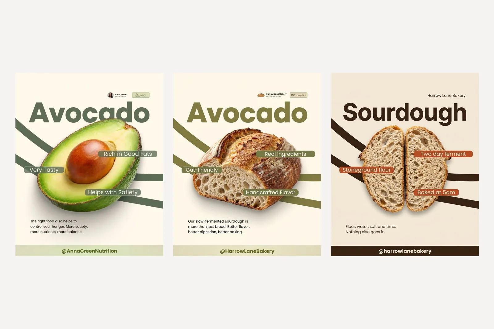
The model did exactly what it was told. Like this one meant the headline, the green, the curved bands and the little badge in the corner, so all of them stayed. It swapped the fruit for a loaf and left the word Avocado above it. It also wrote new labels of its own, Gut Friendly among them, and turned the calorie badge into 250 kcal a slice. A bakery that posted this would be making a health claim and a nutrition claim it never made, under the wrong word.
We have watched this in production. An early version of our instruction was a single sentence, on the theory that the attached images could carry everything. In a real run every post in the batch drew the template's own subject, and the template's purple came through over a customer's green. The words went back in because each one had been paying for something.
9. A reference used for layout only
The attached image is a layout reference only. Keep its structure: one huge headline word across the top, one hero object in the middle, three rounded label chips placed over the object, a short paragraph bottom left, and a full width bar at the foot. Change everything else. Make it for a bakery called Harrow Lane Bakery. Headline word: "Sourdough". Hero object: one round sourdough loaf, cut in half to show the crumb. Chips, exactly: "Two day ferment", "Stoneground flour", "Baked at 5am". Paragraph: "Flour, water, salt and time. Nothing else goes in." Bar at the foot: "@harrowlanebakery". Do not keep the avocado, the green, the nutritionist name, the portrait or the calorie badge. Colours by role: background warm cream #F4EBDD, headline and curved bands deep brown #3A2618, chips burnt orange #C4572F with cream type. Top right, in place of the portrait and name, set "Harrow Lane Bakery" as small plain type.
The trick is the first two sentences. Name what the reference is for, list the parts of it you are keeping, and say that everything else changes. Then name the things to drop, one by one. It feels like over explaining and it is the difference between the centre poster and the right hand one.
Only use a reference you have the right to use. Your own past posts are ideal. Somebody else's finished design is their work, and a close copy of it is still a copy, whoever drew it.
Why a longer prompt is not a safer prompt
The instinct after a failure is to add a rule. After enough failures there is a page of them. We tested where that ends by pasting the same ten sensible design rules fourteen times over, 140 rules and 5,967 characters, in front of a one line request for the bakery poster.
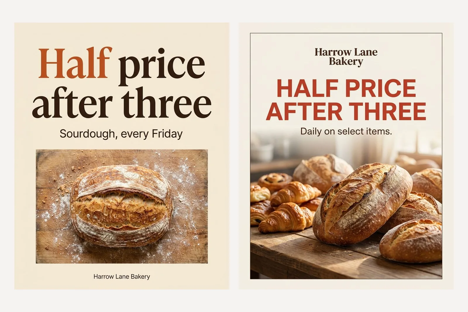
It drew a picture, which is worth saying because it has not always. Then it broke two of its own rules. Do not add decorative borders: there is a border. Do not invent a slogan: it wrote Daily on select items under the headline, which is not a slogan so much as a false statement, because the offer in the brief is Fridays only.
Compare the nine working prompts, which carry a handful of bans each, no logo and no icons among them, and kept every one. The difference is not that negative instructions fail. It is that a few, attached to a clear description of what you do want, hold, and a wall of them does not. Google's guidance points the same way, recommending that you describe the intended scene positively instead of listing what to leave out. One run each is thin evidence, so treat this as a direction to test and not a law.
Before you post it
- Read every word on the poster against the prompt, digits first. A model that set twelve rows correctly today is not a model that cannot get one wrong tomorrow.
- Look for anything you did not ask for: an extra line, a badge, an emblem, a border. The Avocado poster had three additions, and each one was a claim.
- Check nothing on it belongs to somebody else. Generated artwork picks up real logos, real products and real characters more often than you would expect.
- Know that the file is marked. Google states that all generated images include a SynthID watermark, and the files we received also carried a provenance record that Instagram reads. What that does to your post is covered in why Instagram labelled your post AI info.
Frequently asked questions
Can Gemini design a poster with the right text on it?
In our tests on 20 September 2026, yes. Every headline, price and date we put in quotation marks came back set correctly, including a six row price list and a six row table of opening hours. That was one run per prompt, so proofread every poster before it goes out. What it gets wrong is not spelling but facts: anything you leave out, it invents.
What is the best Gemini prompt for poster design?
One with six parts: the format, one sentence on the subject, every word in quotation marks, where things sit in the frame, colours given a role as well as a hex code, and a line about the type and the logo. A five word prompt returned a poster with an invented business name, address and offers. The six part version of the same request returned exactly what was asked for.
Why does Gemini add a logo I did not ask for?
Because a poster usually has one, and the model completes the shape of what you asked for. Say no logo, no emblem, and ask for the business name as small plain type. If you do have a logo, attach the file and say the attached image is the logo to be used unchanged. Describing a logo in words gets you a new one that looks deliberate and is not yours.
Can I give Gemini a reference poster to copy?
You can, and a one line prompt will copy far more than you meant. Ours kept the reference's headline word, colour and badge, and produced a loaf of bread titled Avocado. Say the image is a layout reference only, list the parts of the structure to keep, state that everything else changes, and name the things to drop. Only use references you have the right to use.
Should I generate the product photo as well?
No. A generated candle is not your candle, and the customer is about to buy the real one. Photograph the product yourself, attach the photo, and ask Gemini to build the layout around it. Generate abstract backgrounds, colour and type. Photograph anything a customer could recognise: your product, your premises and your team.
Does a longer, more detailed prompt give a better poster?
More facts help. More rules do not. A 690 character brief was followed exactly. A 5,967 character prompt made of 140 design rules returned a poster that broke two of them, adding a border that was banned and inventing a line of copy that made the offer untrue. Describe what you want and keep the list of bans short.
Will Instagram label a Gemini poster as AI?
It can. The files we received from Google's API carried a provenance record marking them as AI generated, which is the kind of signal Meta says its systems read. Instagram's help centre says images do not have to be labelled by you, but may still receive a label if Meta detects they were AI generated. We cover what we found in a separate article on the AI info label.
How we researched this
- Every prompt on this page was sent to gemini-3-pro-image through Google's developer API on 20 September 2026, once each, at the 1K size, and the picture that came back is the picture shown. Nothing was regenerated until it looked better and nothing was retouched. Seven of the results have since gone into our gallery as they came, next to everything else this model has drawn for us. One run per prompt is a small sample, and the article says so wherever a conclusion leans on it: a result here is what happened, not a rate.
- The businesses in the prompts are invented so the results could be printed without borrowing anybody's name. The script that ran them is in our repository as scripts/_gemini-poster-tests.mjs, which exists so the claims can be checked again when Google changes the model underneath them. When that happens this page gets re-run and corrected rather than left standing.
- One thing we expected to find, we did not. Our own production notes say that a prompt of several thousand characters stops returning a picture at all. That was true of an earlier model with a much longer prompt and attachments. A 5,967 character text prompt returned a picture on the current model in 41 seconds, so the claim is not repeated here as a fact. What the long prompt did instead is in the section on rules.
- We make a product that generates posts with this same model, so we have an interest in how capable it looks. The failures are printed at the same size as the successes for that reason. Feature descriptions were checked against Google's documentation on 20 September 2026 and are linked below.
Sources